Heat Maps
Configured in
Settings → Heat map. A map display type should be selected for these preferences to appear.
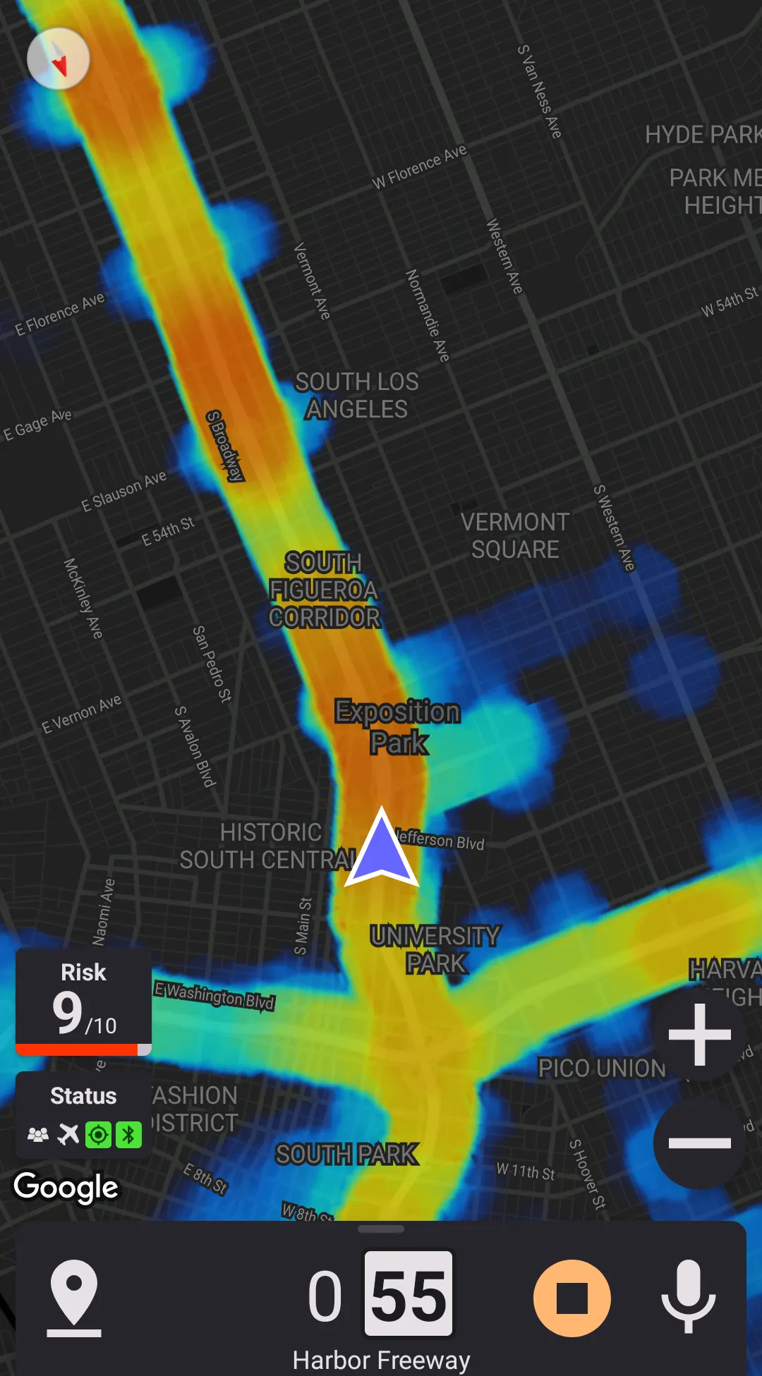
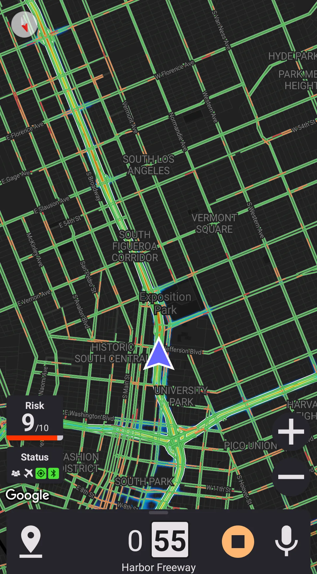
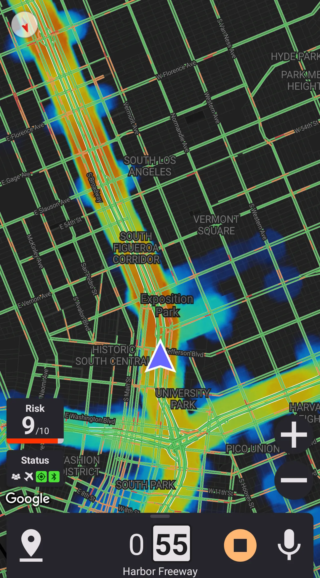
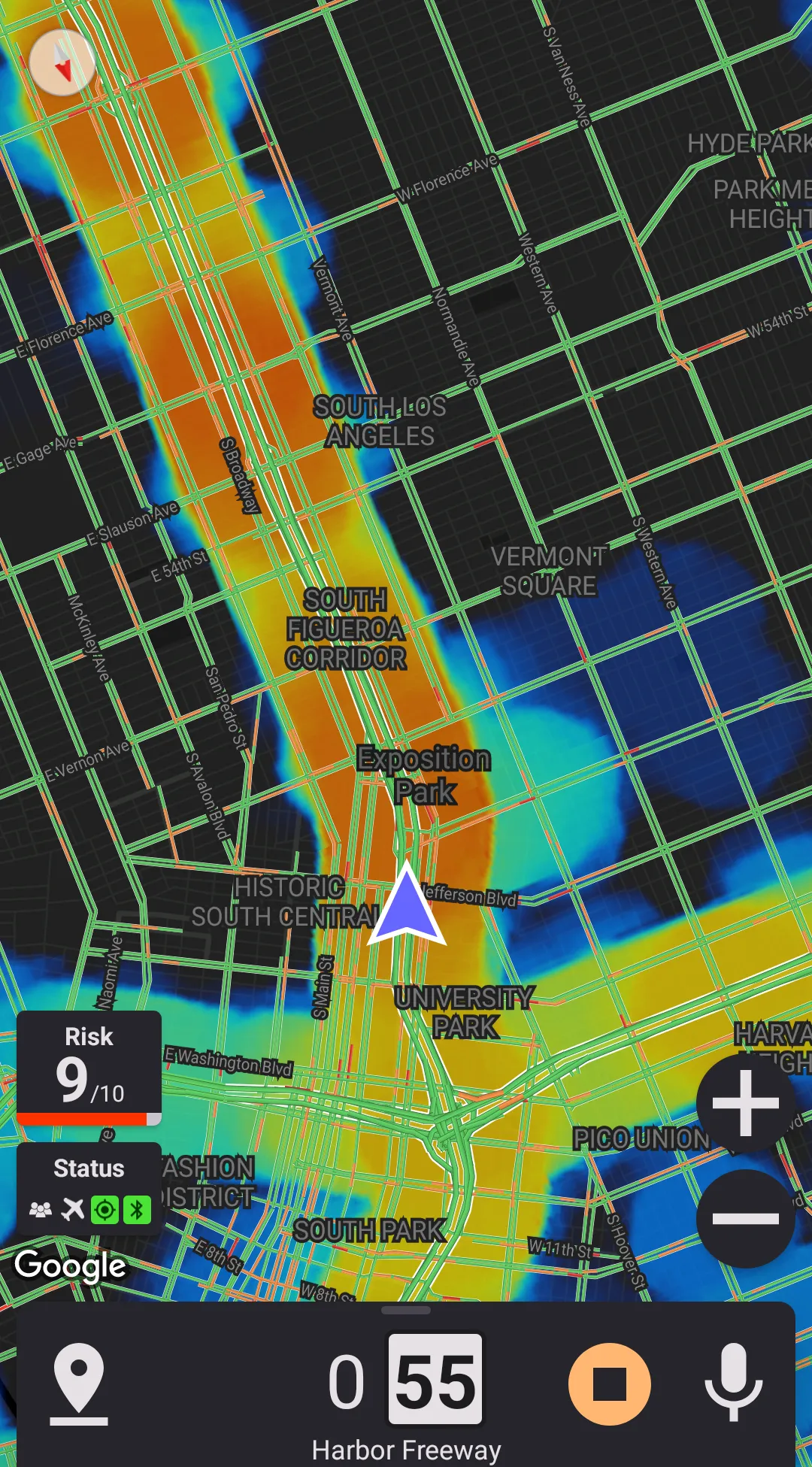
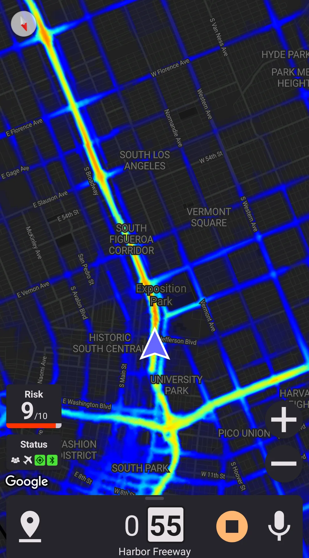
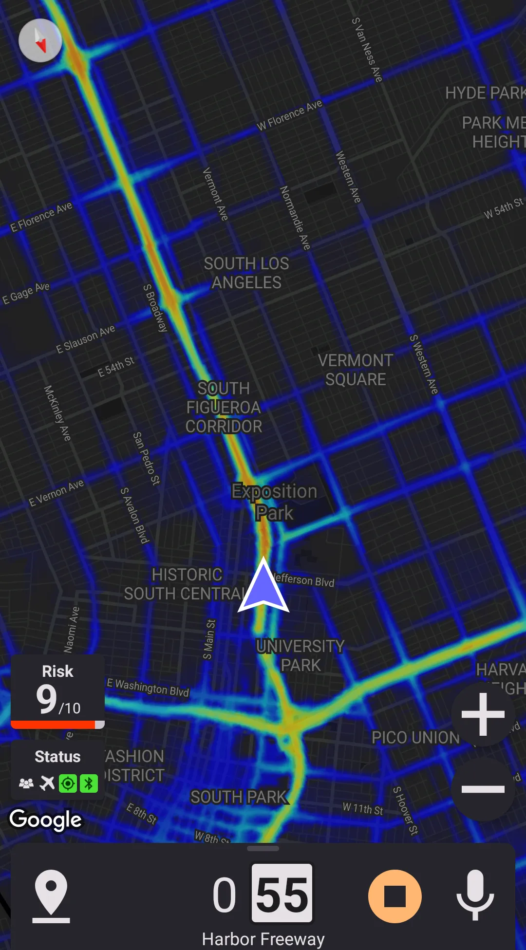
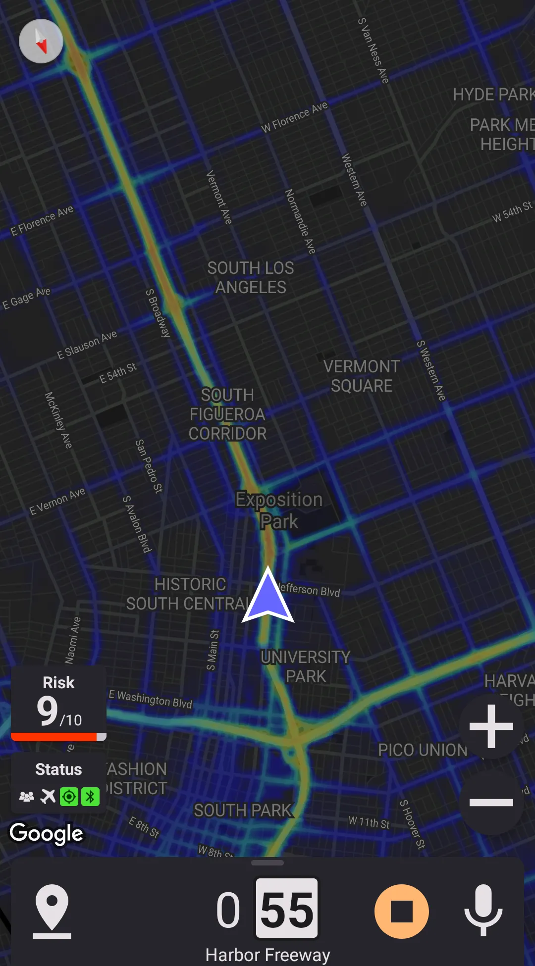
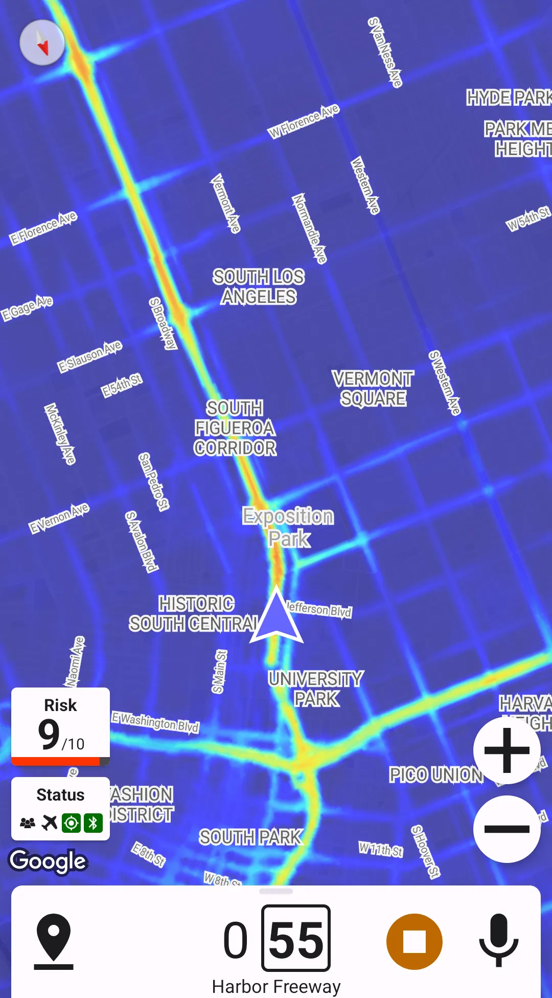
Heat maps can show where police reports appear more often; this can help identify frequent locations of speed traps or traffic stops.
Building Heat Maps
Heat maps are generated based on crowdsourced data and contain information for the past year.
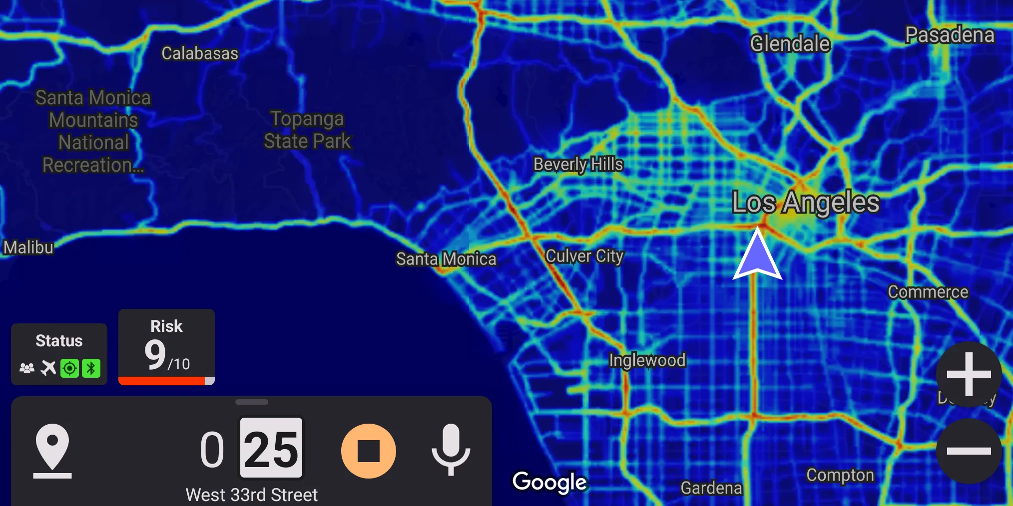
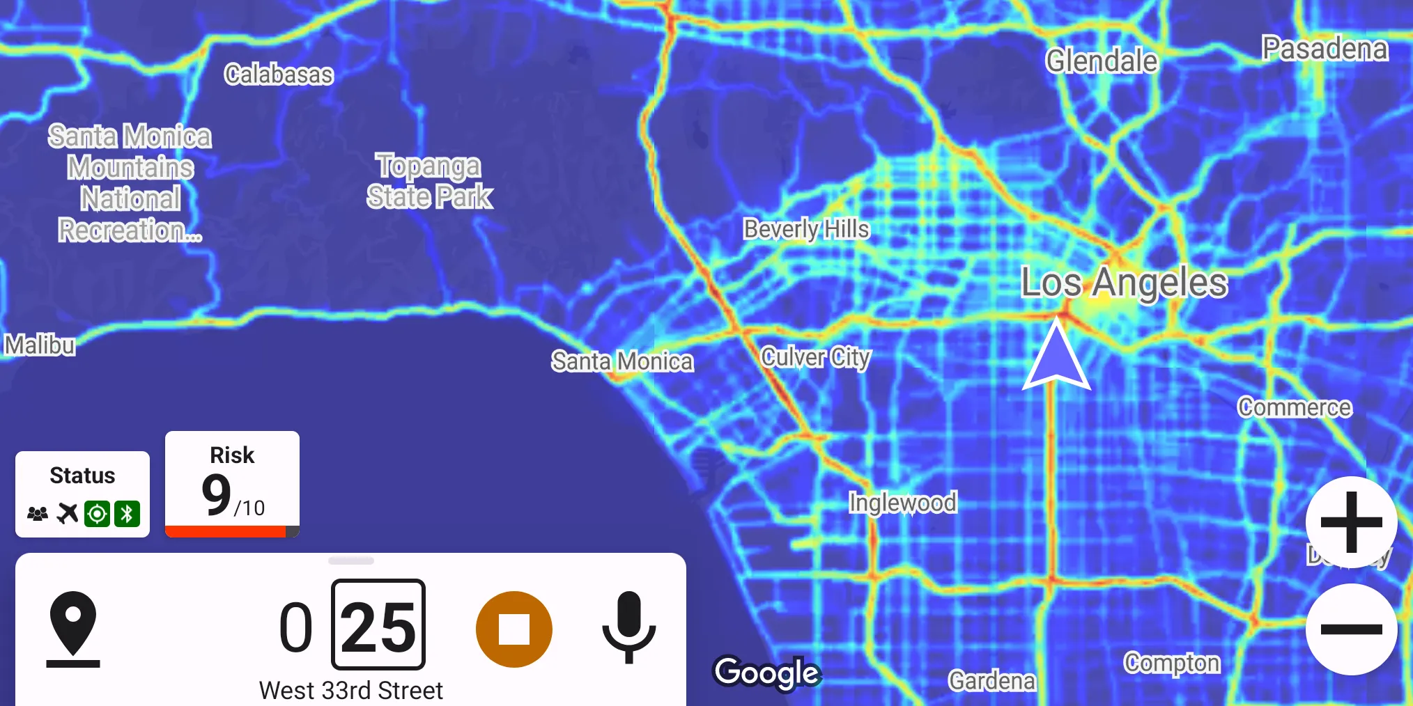
Heat maps are normalized to the area around. Normalization means that if there are many police reports in some area in general (say, in Manhattan) – the entire area is painted colder to allow still seeing more frequent locations of police reports. It also means that a "red" spot in a rural area has an entirely different meaning than a "red" spot in a downtown megalopolis. Normalization helps demonstrate where police are seen often; however, it doesn't help with showing how often police are seen there. To know how often is police seen in the area, check out the Risk Estimation section.
As the map is zoomed out, the colors get normalized to a larger area. It can lead to some hot areas disappearing as the map is zoomed out – this effect is especially noticeable close to big cities.
Presentation
There are four preferences responsible for heat map presentation. Their effects are outlined below.
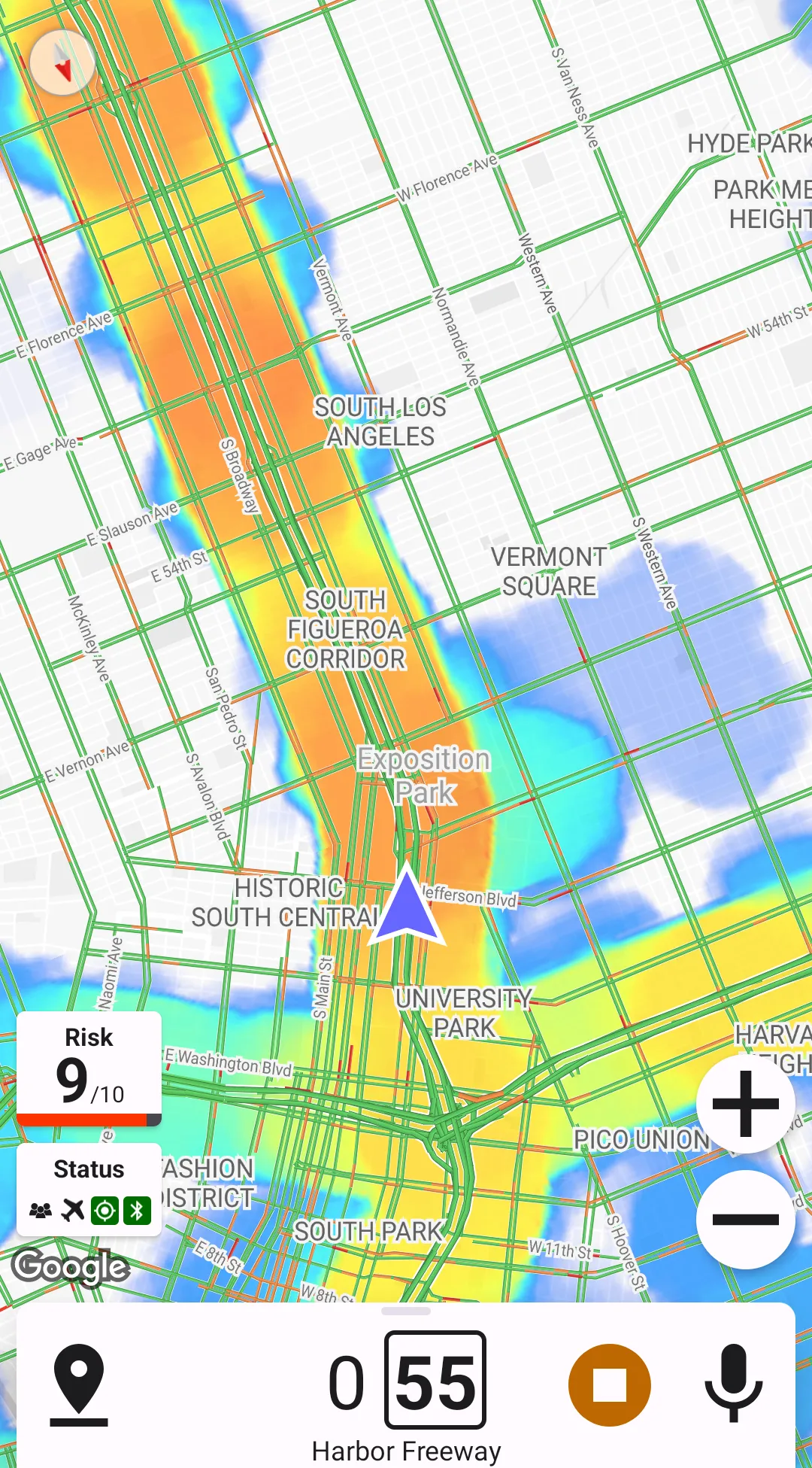
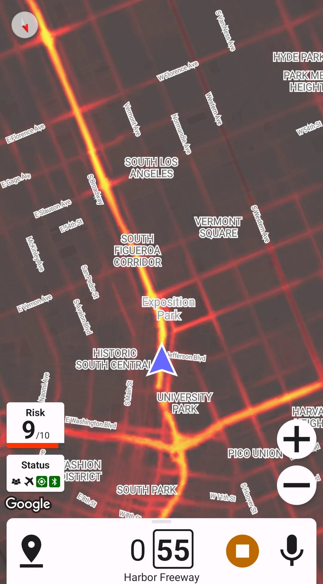
Overlay Opacity
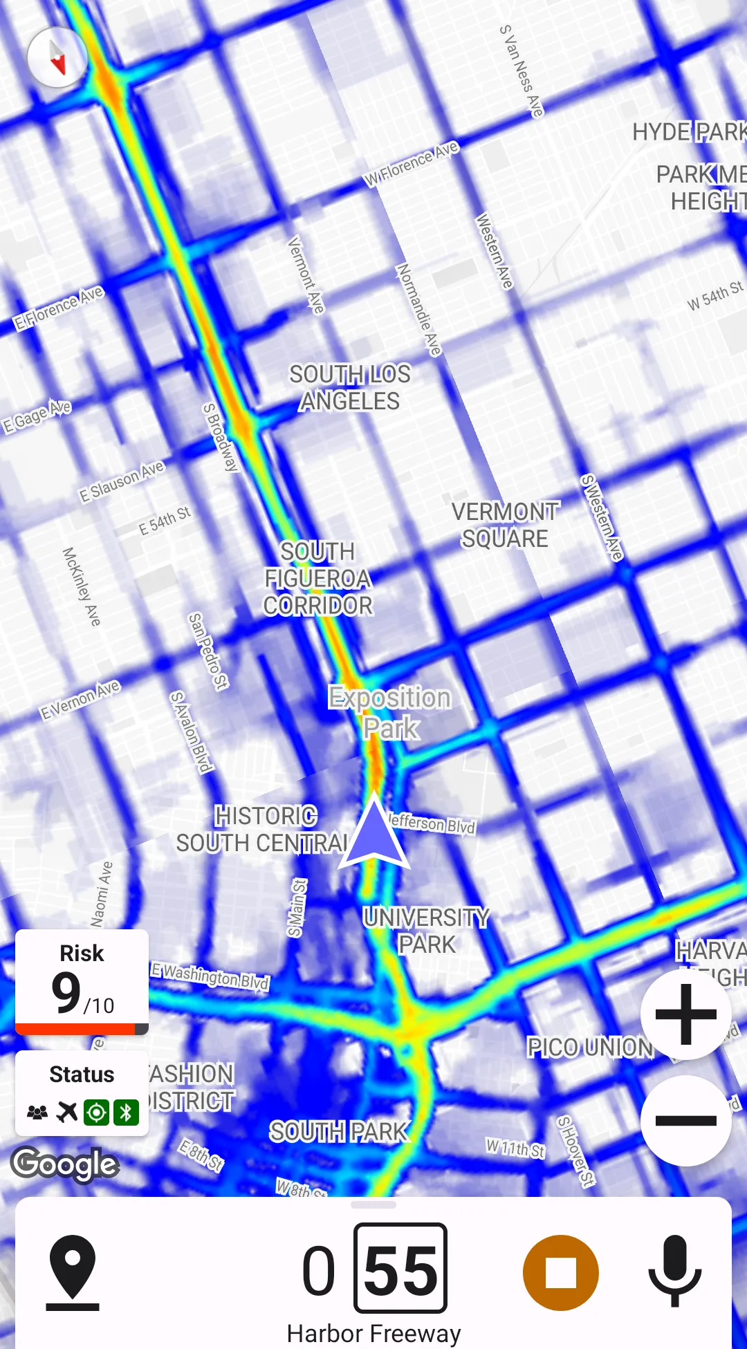
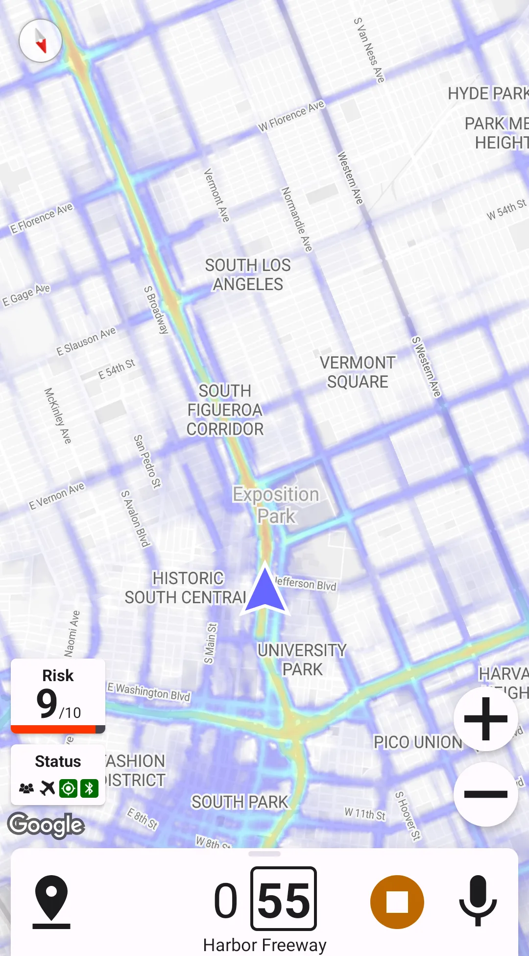
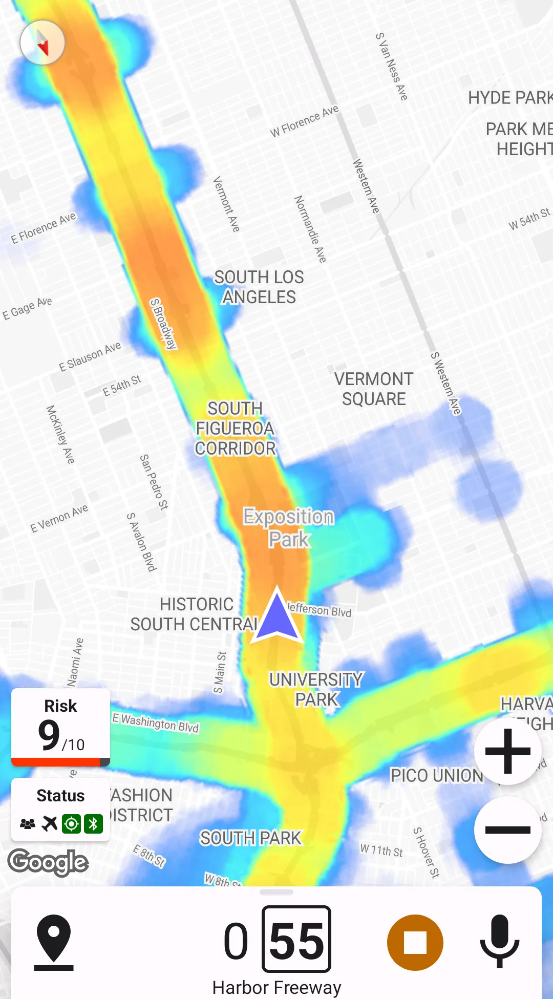
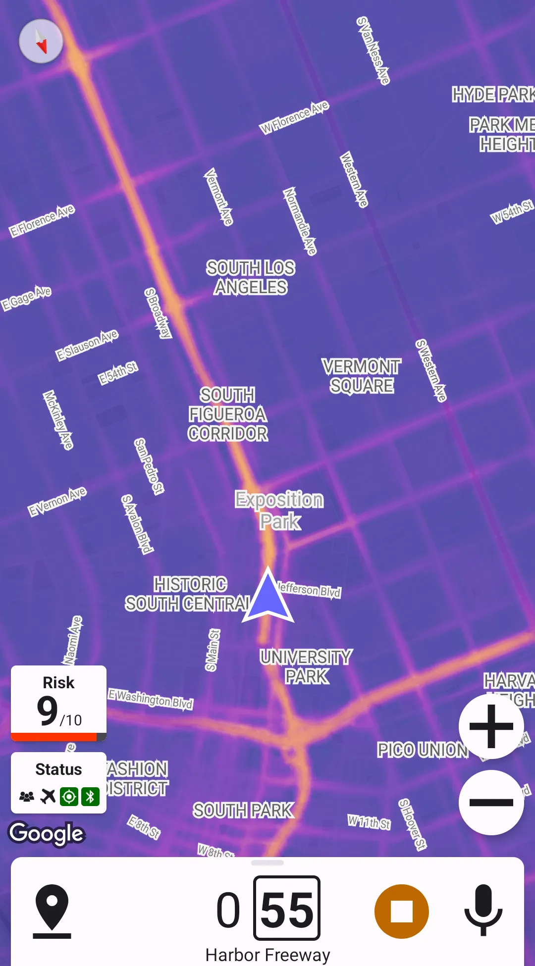
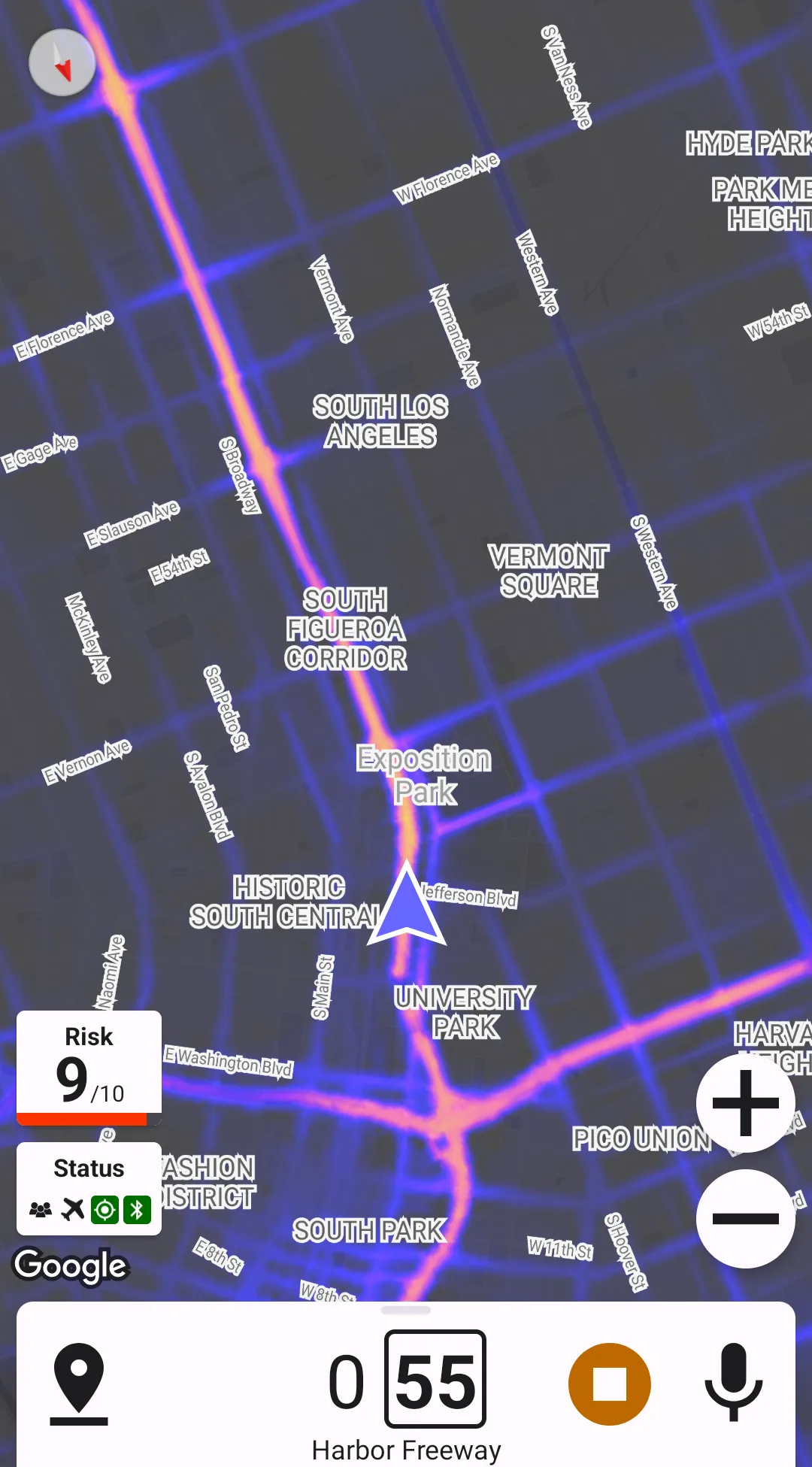
Transparent Backround
Transparent background allows not painting "cold" areas of the heat map, which can help declutter the map.
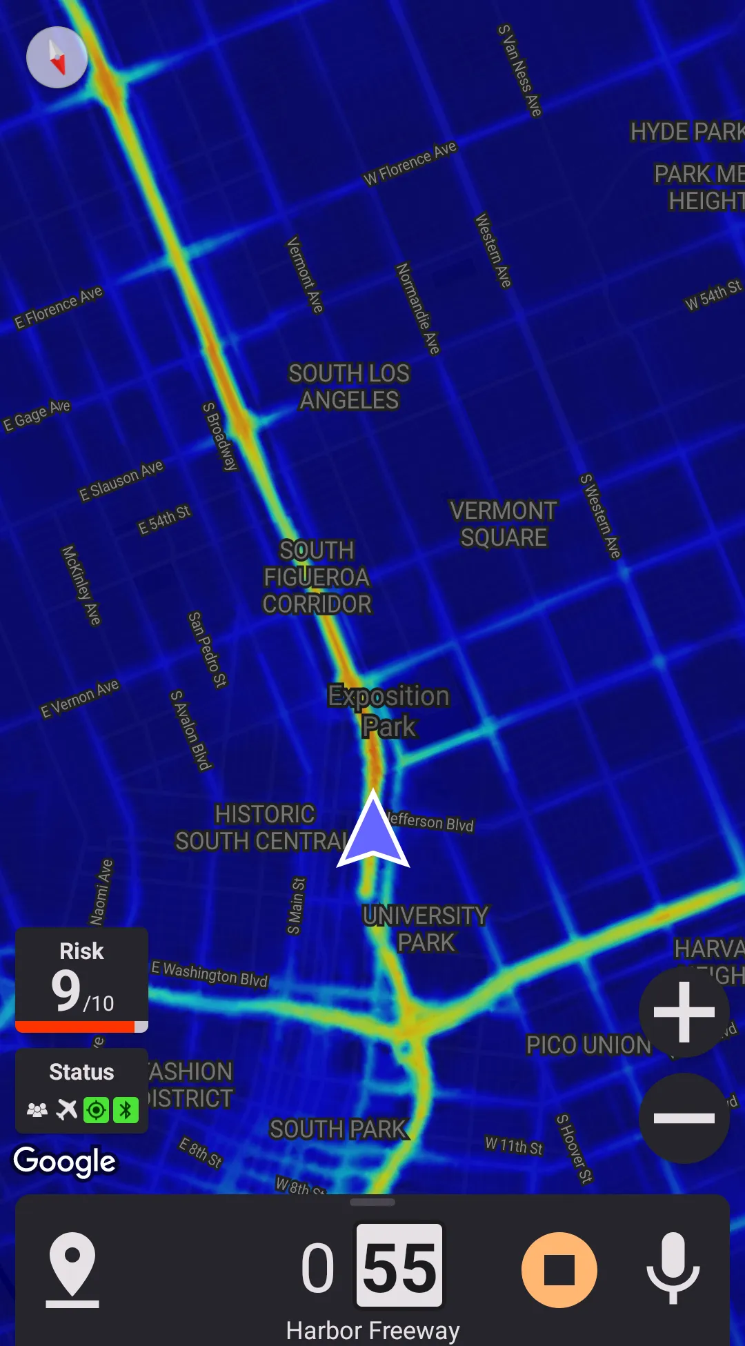

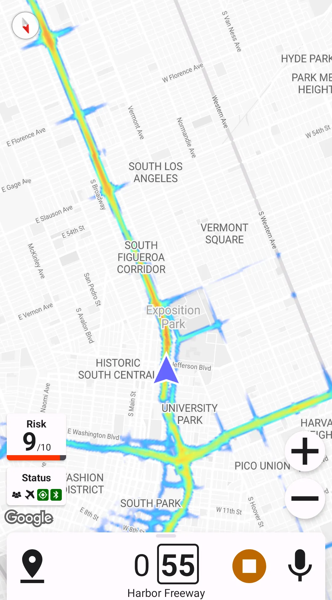
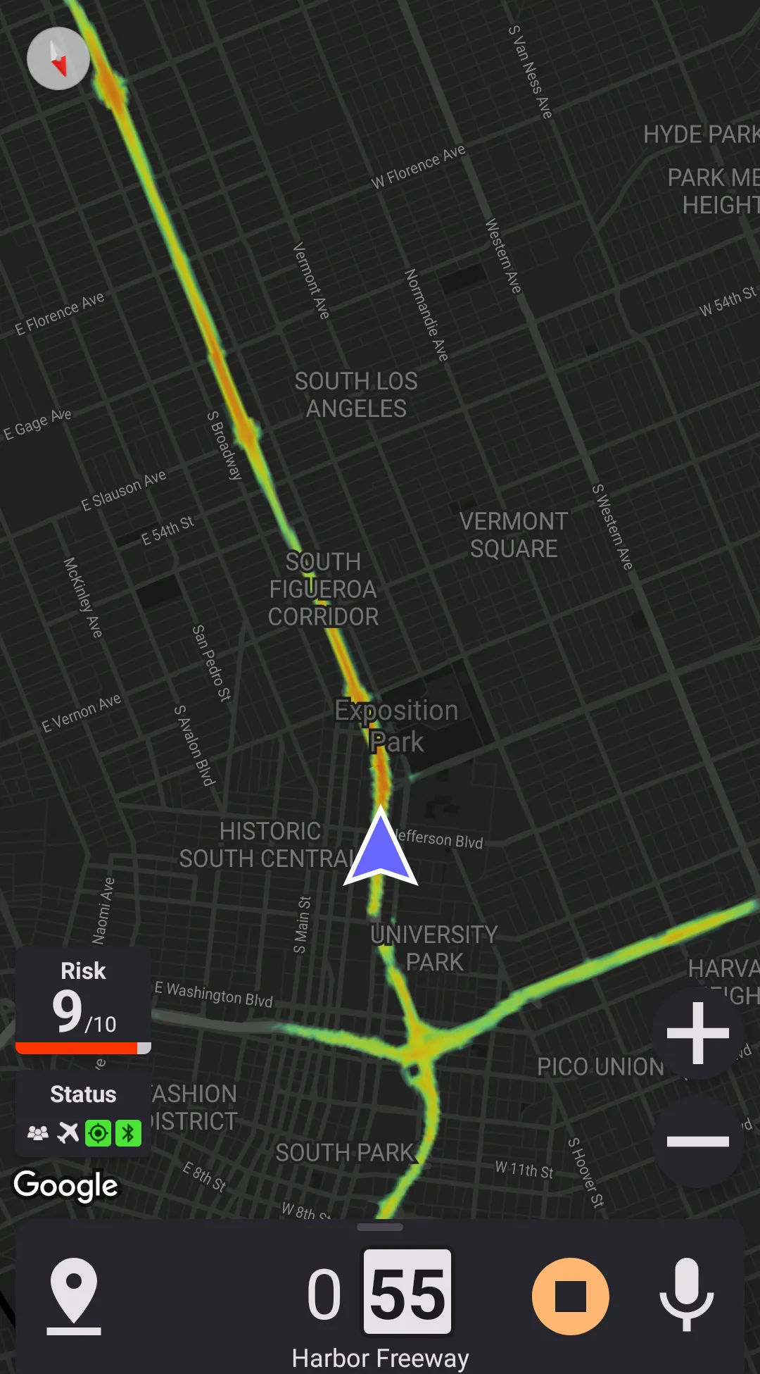
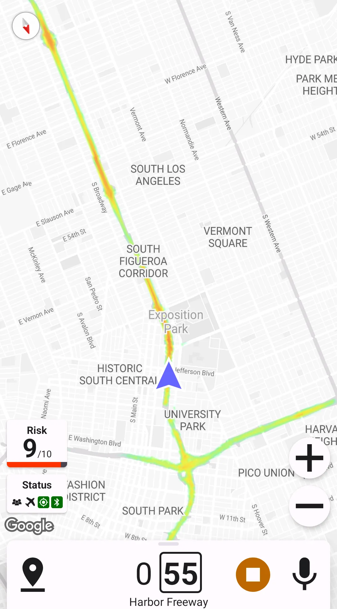
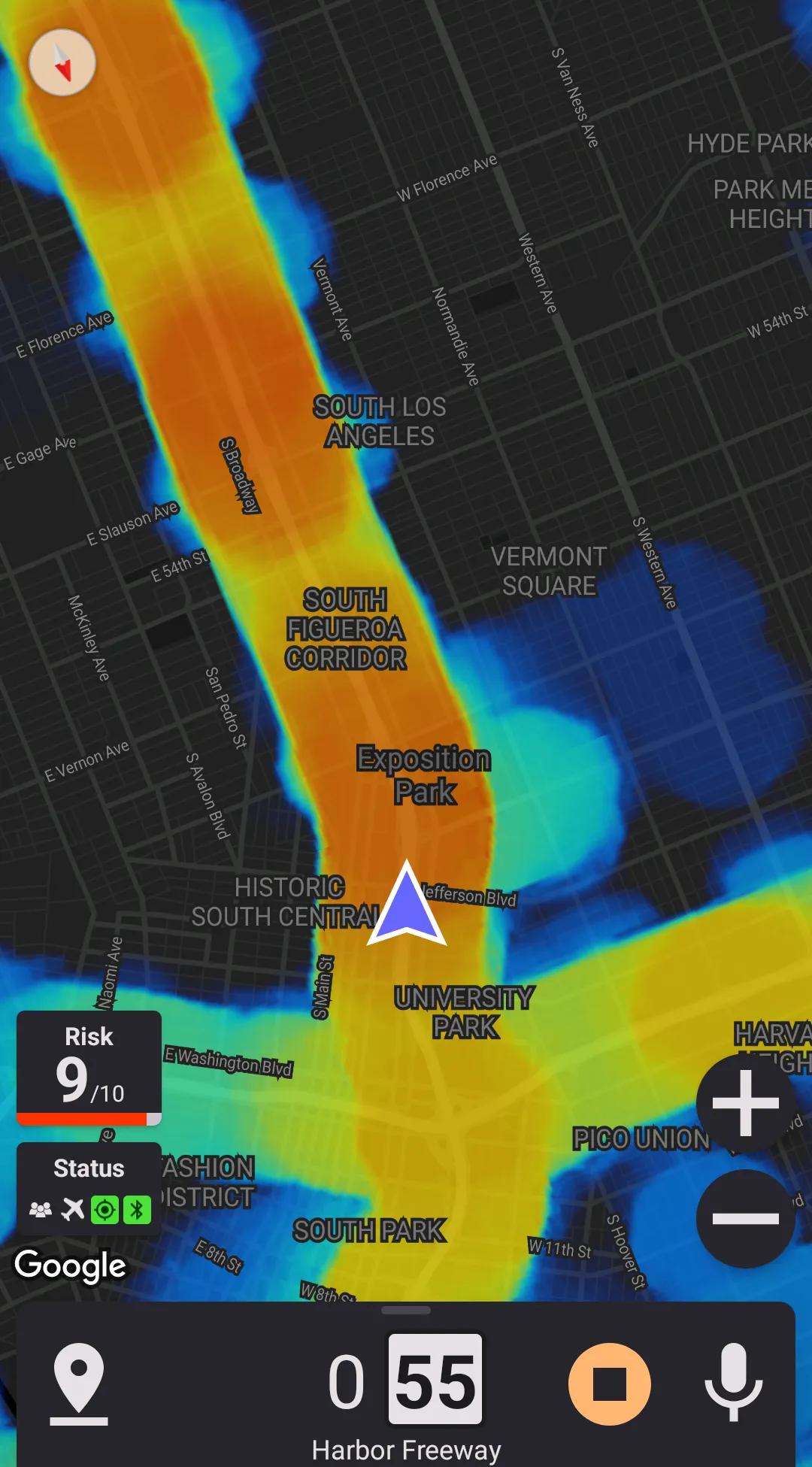
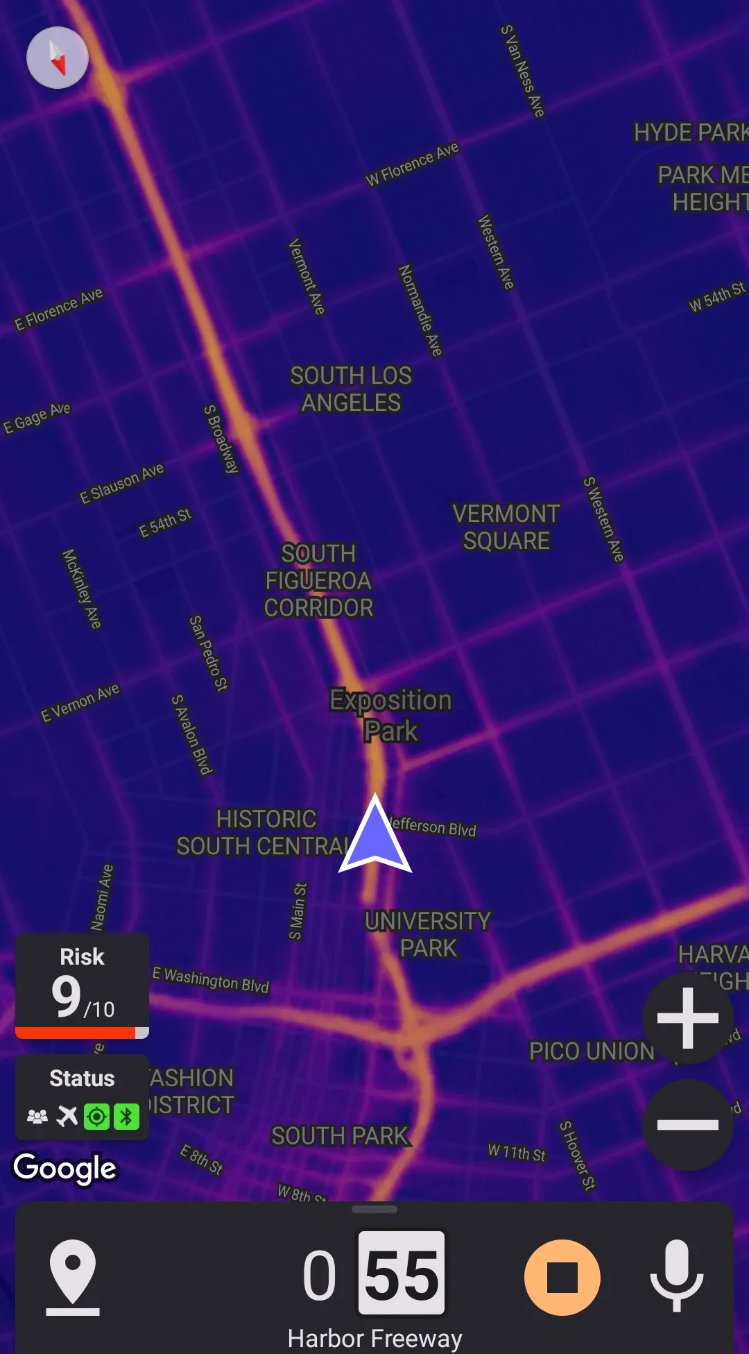
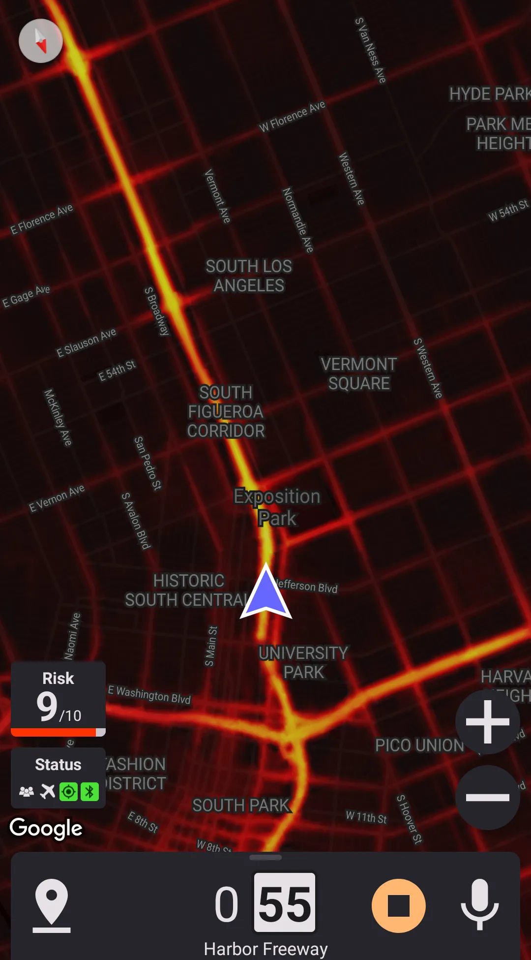
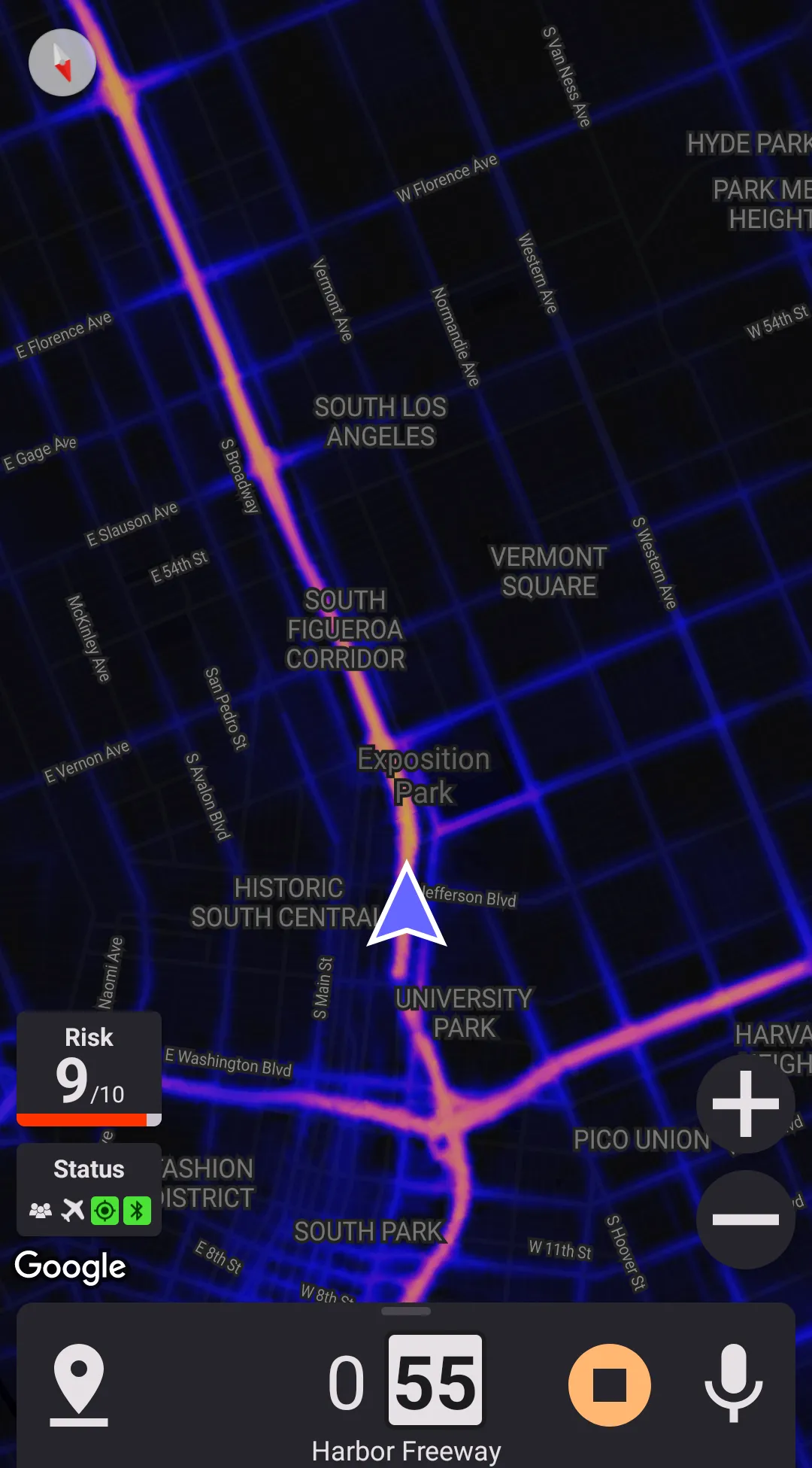
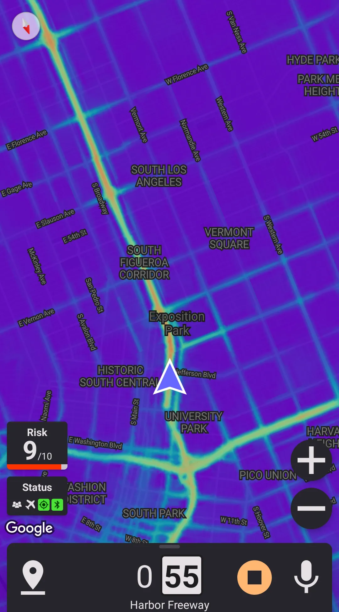
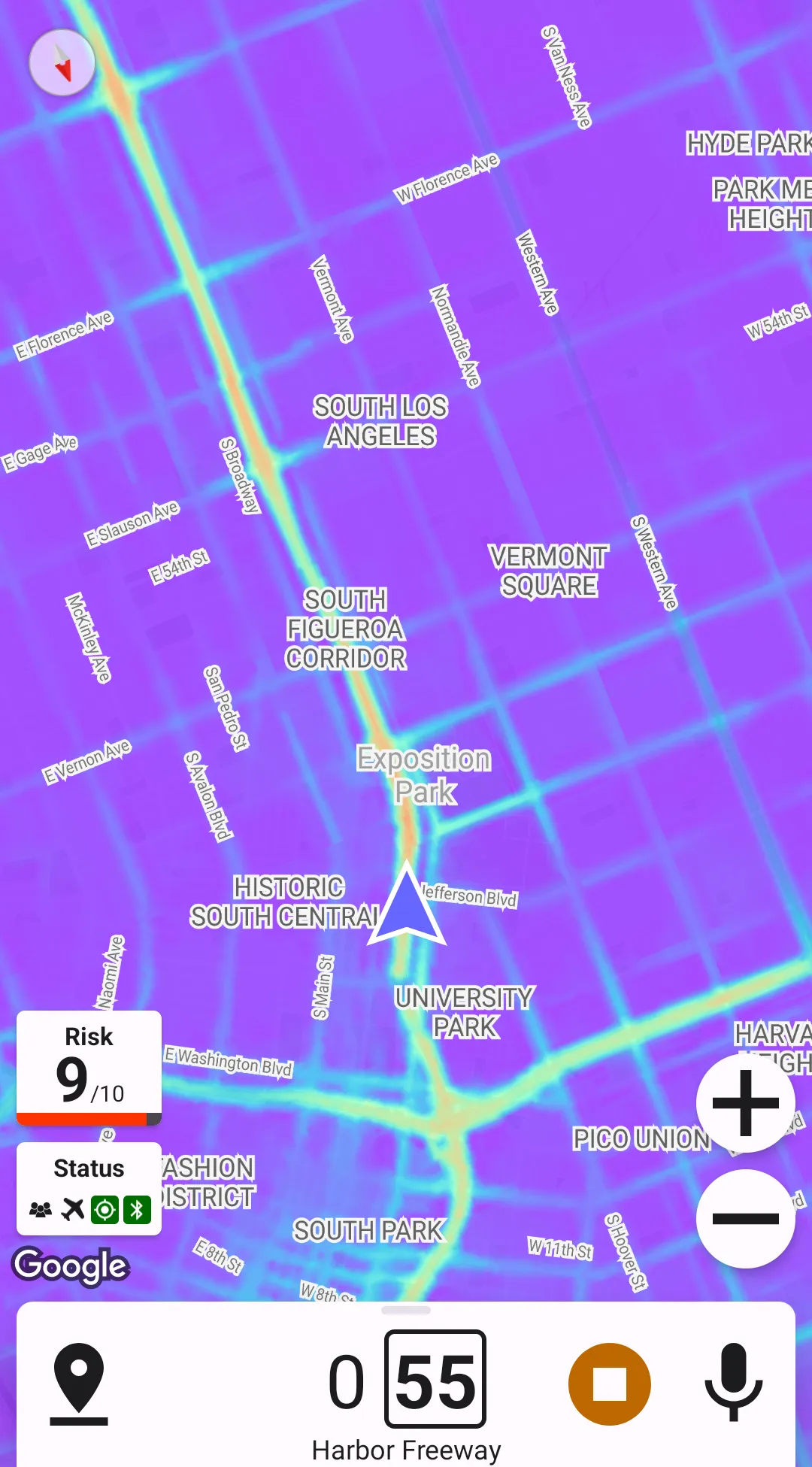
Color Map
There are 5 color maps supported.

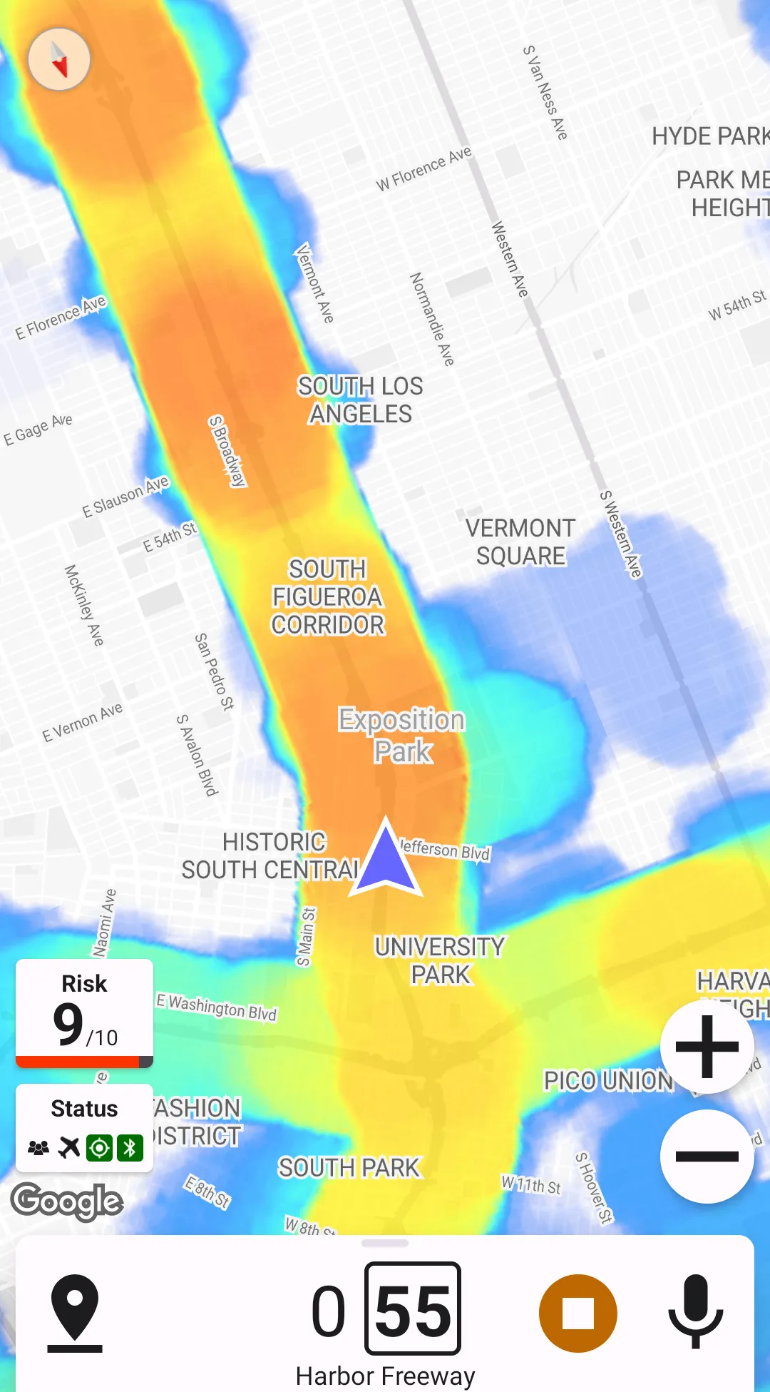
Heatmap Dilation
This preference allows extending the "hot" areas. It is useful when the heat map is combined with the traffic jam layer.